

A website redesign should help customers understand the offer, compare relevant options and take a useful next step. Vining Stone Supply's rebuild shows how those decisions shape navigation, location pages and practical planning tools.
Start with the questions customers need to answer
A stone supplier's website has several jobs. A homeowner may be choosing material for a path. A contractor may need to discuss quantities and delivery. A rural property owner may be looking for larger stone and the yard best suited to that project.
For Vining Stone, we organized the redesign around those decisions: what material fits, where to see it, how much might be needed and how to speak with the right team. That gave the visual work a clear purpose. Each major page needed to move a customer toward a more informed choice.
The existing site already held useful product pages, photographs, location information and articles. Our starting point was to understand and preserve that material while improving how the pieces connect.
Make the main routes visible
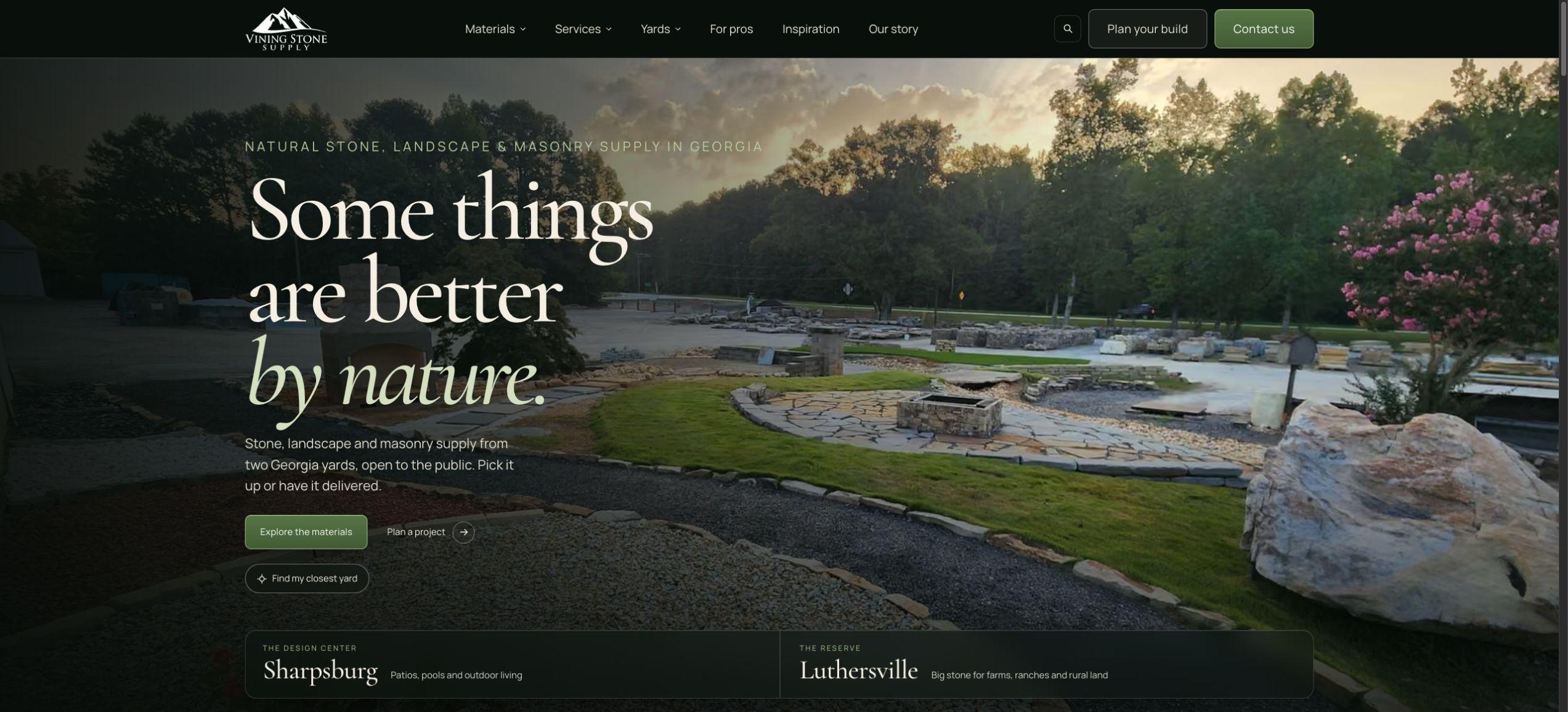
The existing Vining Stone homepage uses a large landscape photograph, a collapsed navigation menu and a broad contact action. In the new desktop design, the main routes are visible: Materials, Services, Yards, For pros, Inspiration and Our story, alongside planning and contact actions.
The homepage gives visitors choices that match different levels of readiness. Someone still exploring can browse materials. Someone with dimensions can begin a plan. Someone preparing a visit can choose a yard.
That is a useful design question for any business: can a first-time visitor find the next relevant step without already knowing the company?
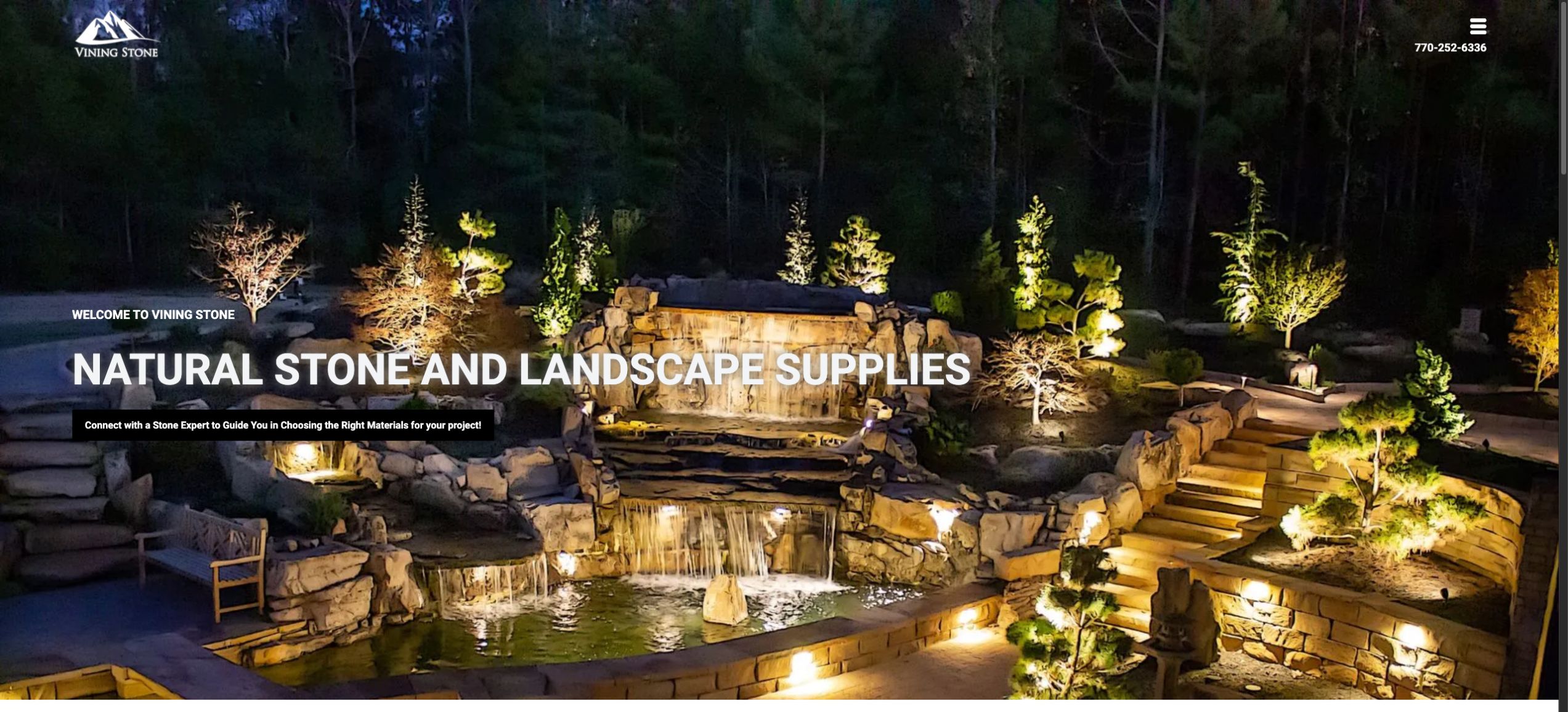
Existing public homepage, captured November 9, 2026.
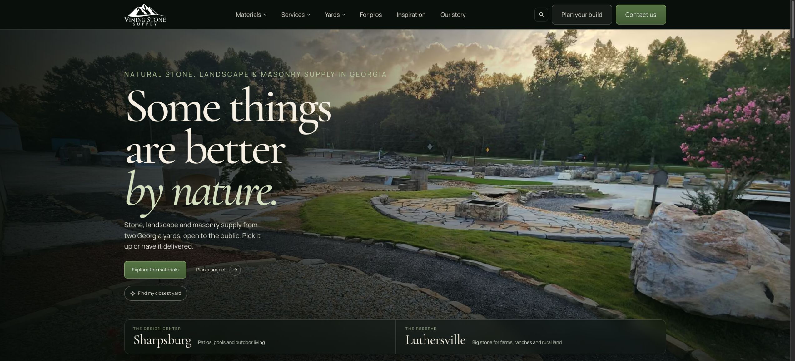
The redesigned homepage, captured at the same desktop viewport.
Give each location a reason to exist
Vining Stone's two yards share a brand, but the redesign gives each a distinct emphasis. Sharpsburg's Design Center introduces patios, gardens, pools and residential outdoor living. Luthersville's Reserve introduces larger stone and rural-property projects.
We carried that distinction through photography, language and onward links while keeping the navigation and tools consistent. The homepage introduces both yards early, so choosing a location becomes part of planning the project.
For a business with multiple locations, an address is only part of the answer. A useful location page also explains what a customer can do there, who to contact and how that location relates to the customer's task.
Turn browsing into a plan customers can bring to the team
The new Plan Your Build page connects material selection with a saved list, quantities, yard choice, pickup or delivery preferences, notes and print output. A calculator estimates loose volume from area and depth.
For example, a 12-by-10-foot rectangle at a uniform depth of 3 inches contains 30 cubic feet, or approximately 1.111 cubic yards. The calculator rounds that estimate up to 1.12 cubic yards. The page makes clear that the yard confirms the final quantity, availability and pricing.
That distinction matters. A planning tool can help a customer prepare a better inquiry without pretending to provide live inventory, binding prices or a confirmed order. The yard remains responsible for confirming the details with the customer.
The broader lesson is to choose a tool that serves the customer's actual preparation. A material list suits a supplier. Another business may need a service comparison, a preparation checklist or a booking flow.
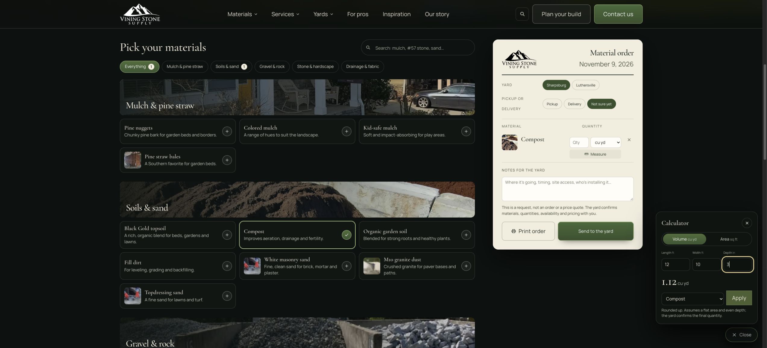
A planning example using 12 by 10 feet at 3 inches deep.
Treat established URLs as part of the rebuild
Changing a website's appearance does not require renaming every page. Vining Stone's rebuild uses a legacy URL inventory and keeps established material paths in the migration approach.
When URLs do change, prepare a page-specific mapping, update internal links and verify the redirects on the deployed site. Google's site-move guidance describes URL mapping, permanent redirects and monitoring, and warns that rankings may fluctuate during significant changes.
For a business owner reviewing a redesign, ask to see the migration plan alongside the visual design. Existing product pages, articles and links deserve a deliberate decision.
Keep the visual story connected to the work
Vining Stone's new design uses dark forest surfaces, warm type, restrained olive actions and large photographs. The visual distinction between the two yards reinforces the choices the site asks customers to make.
The same care extends to product browsing, delivery information, contact and planning. Those pages are part of the experience a customer uses to make a decision. A polished homepage alone would leave much of that work unfinished.
When reviewing your own site, follow one real customer task through every relevant page. Check the information, links, mobile layout and next action together.
What Vining Stone's owner said
“He took our numerous very broad product lines, and condensed them into an easy to navigate structure that's concise yet informative.”
Nick Leigh, owner of Vining Stone Supply. Excerpt from his five-star Google review.
Check the rebuild on desktop and mobile
The supplied Vining Stone Lighthouse audits show desktop Performance moving from 95 to 100 and mobile Performance from 71 to 100. In the captured rebuild runs, Performance, Accessibility, Best Practices and SEO each scored 100 on both devices. SEO improved from 85 to 100 on desktop and mobile. The separate Agentic Browsing check improved from 2/3 to 3/3 on both devices.
The comparison below documents those audit snapshots. Results vary by run, and the original mobile audit noted browser-extension interference, so the figures should be read with that test context. These audit scores are separate from the customer and business measures discussed next.
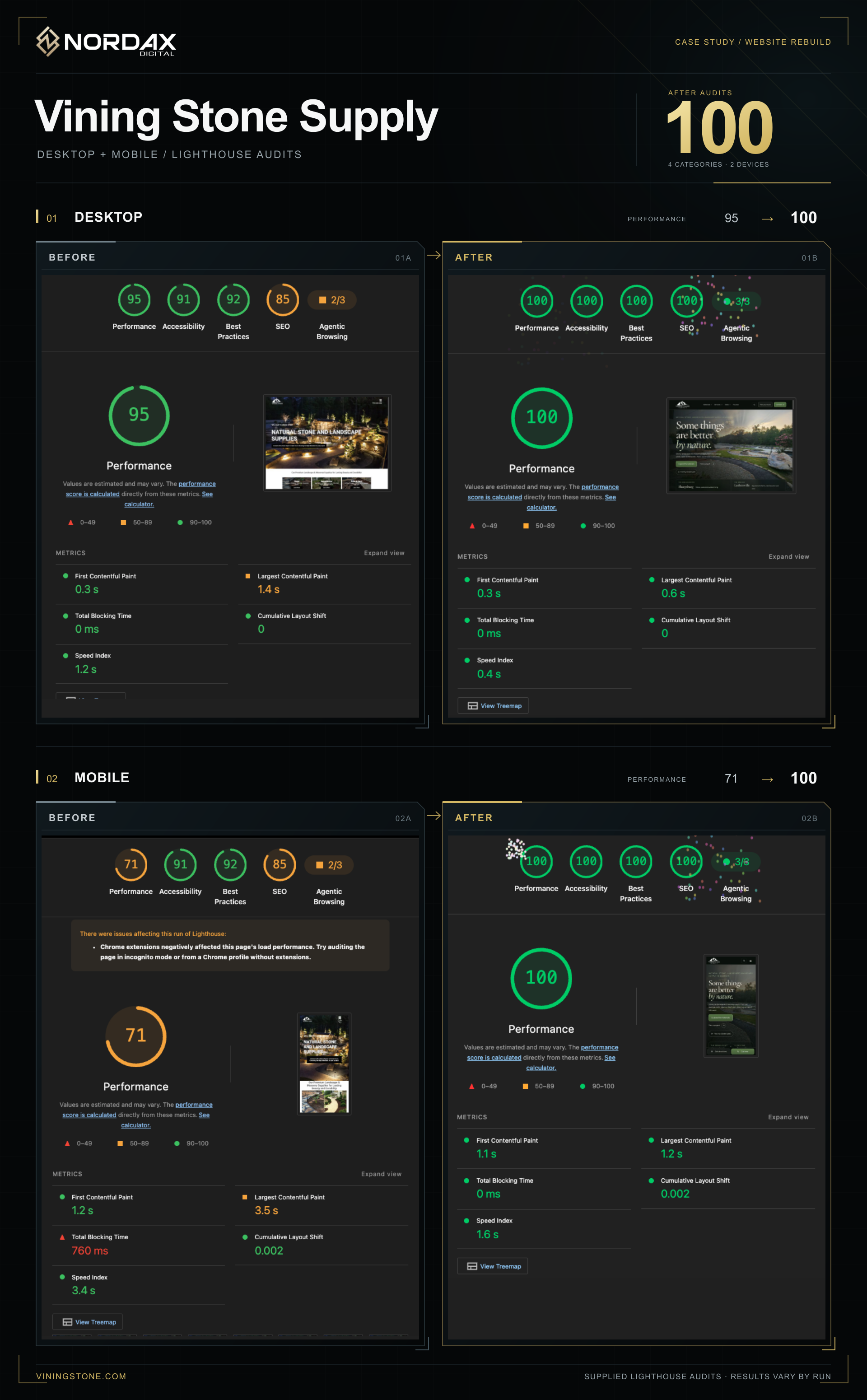
Audit comparison supplied November 10, 2026. Desktop Performance: 95 to 100. Mobile Performance: 71 to 100.
View the full-size audit comparison
Use search and analytics to improve the customer journey
Vining Stone's site search connects directly to NordaxOS reporting. For visitors who allow analytics, the website records the search phrase, the full number of matching results and the result selected. The team can compare popular phrases, find searches that returned nothing, review which pages visitors chose and follow daily search trends.
That makes the language customers use a practical input to improving the website. For example, repeated searches for “patio stone” that return no results would give the team a reason to review product names, search matching or missing guidance.
The measurement also covers material selection, saved material lists, calculator actions, yard choices, phone and direction clicks, and confirmed inquiry capture. Those events help the team understand which parts of the browsing and planning experience people use.
NordaxOS brings that website activity together with connected Search Console and Google Business Profile reporting. The team can review discovery and website use in one workspace, then prioritize clearer product information, useful guides and better routes to the right yard.
These reports reflect visitors who allow analytics. A phone-link click shows intent; it does not prove a completed call. The value is a continuing source of evidence for improving the site, with inquiry quality and business outcomes assessed separately.
If you are considering a redesign, begin with the decisions your customers struggle to make and the information your team needs to help them. Bring those questions to a website project conversation with Nordax Digital. The design brief becomes much more useful when it connects those needs to specific pages, tools and measures.