Category
Brand & Identity + Web & Systems
Client
Devi Reiki™
Location
United States
Beyond Spiritual Aesthetics
Devi Reiki™ is not a product, wellness brand, or lifestyle offering. It is a theological system expressed through healing practice. That distinction required a fundamentally different approach to brand identity.
Most spiritual or healing brands default to aesthetic shortcuts: decorative mysticism, sacred geometry, goddess imagery, or trend-driven typography. These approaches dilute authority and collapse under scrutiny, especially when work moves into education, publishing, or professional practice. Devi Reiki required the opposite: authority without aggression, sacredness without ornament, depth without obscurity, accessibility without dilution.
The goal was not to 'make a website,' but to construct a brand identity system capable of holding meaning across decades.
At a Glance
- Complete brand identity system designed before any interface decisions to establish institutional credibility
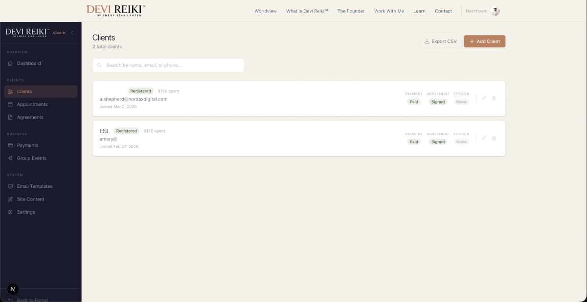
- Full practice management platform: Stripe payments, calendar scheduling, custom contract software, lite CRM
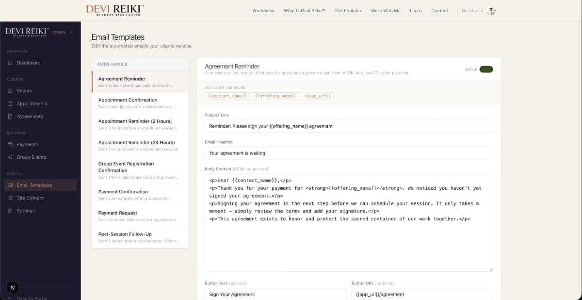
- Automated workflows with transactional emails and customer email automation system
Identity First
Approach
Complete System
Platform
Clerk RBAC
Auth
Stripe Sessions
Payments
What They Needed
What We Built
We constructed brand identity infrastructure first, then built a complete practice management platform on that foundation. Identity governed design decisions; technology enabled institutional operations at scale.
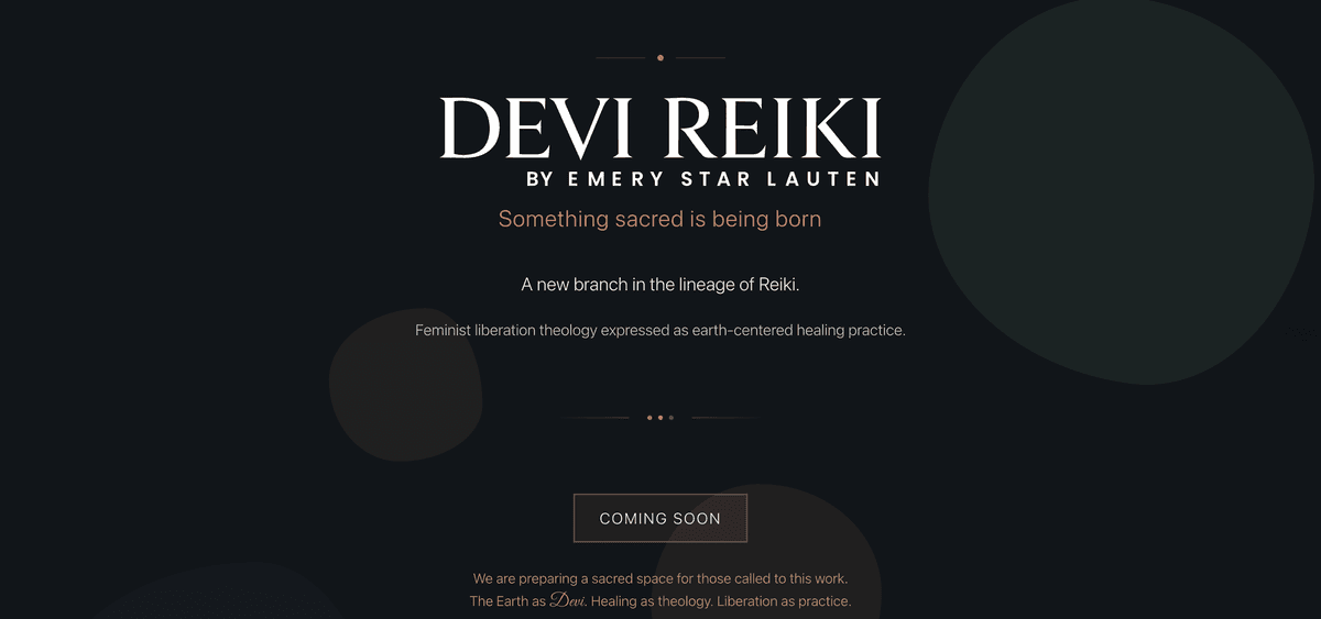
Coming soon page demonstrating slowness over stimulation, initiation space design philosophy
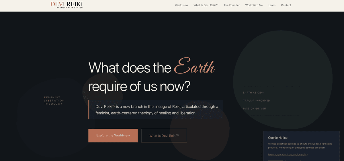
Website following identity infrastructure with restraint, clarity, and institutional positioning
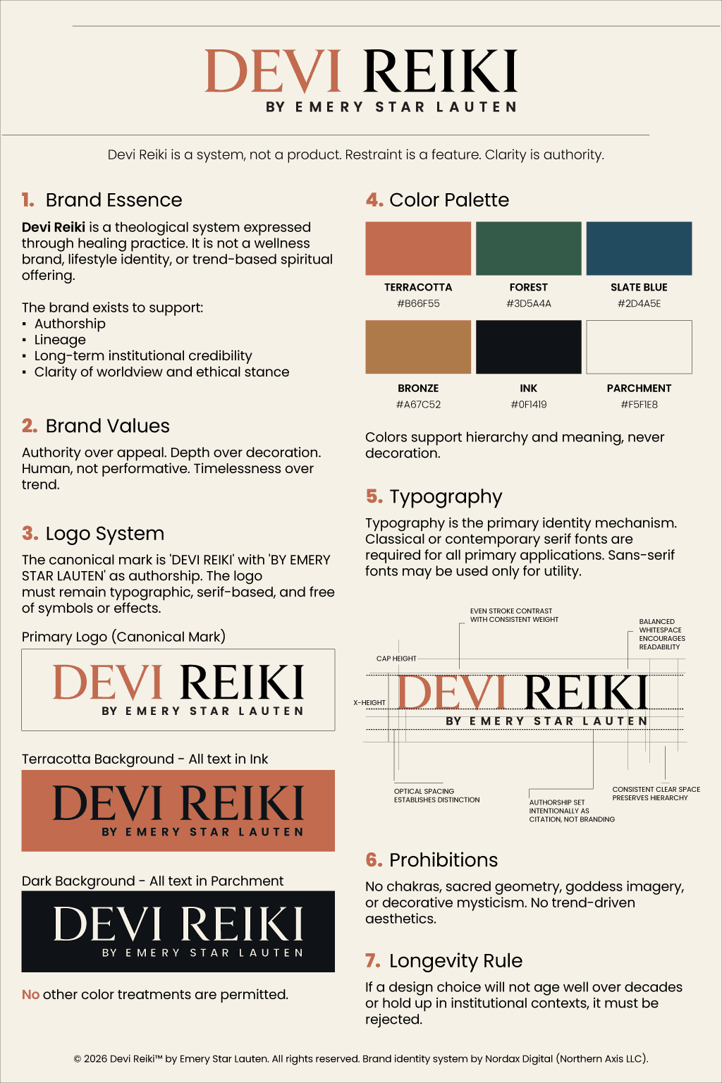
Comprehensive brand guidelines with canonical mark, typography hierarchy, color system, and explicit prohibitions
Admin portal dashboard: practice management, session overview, and client activity at a glance
Admin portal client management: CRM records, session history, and contract workflows
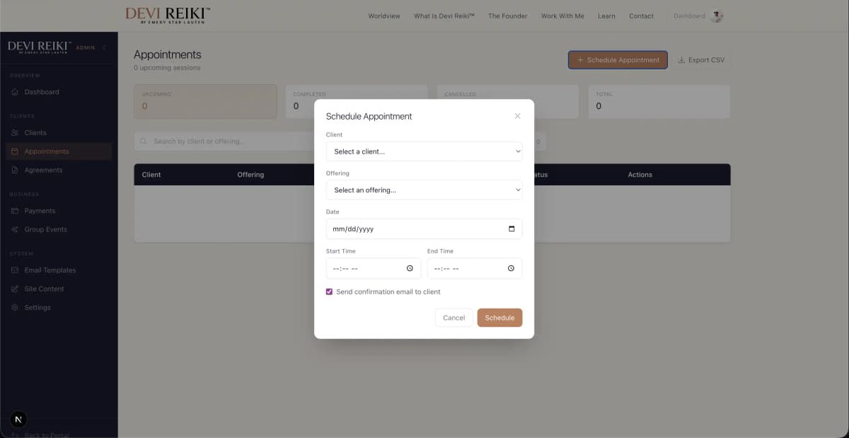
Admin portal scheduling and operations: calendar integration, booking management, and automated workflow controls
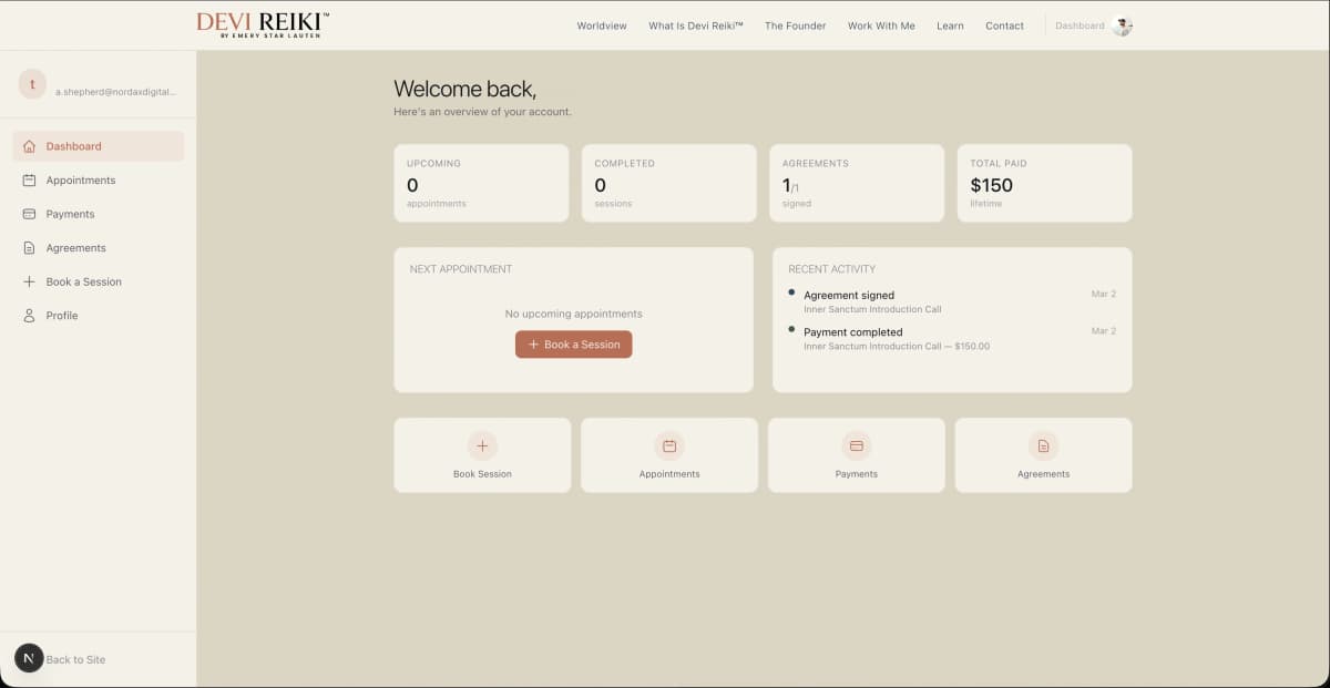
Client portal experience: branded access to session booking, program materials, and account management
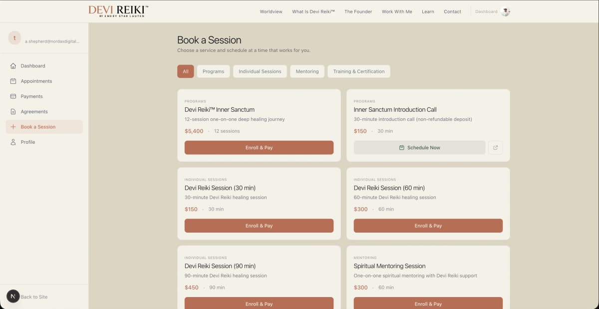
Client portal sessions and contracts: booking history, digital contract signing, and payment management
Technical Details
Brand Identity
- Canonical typographic mark
- Serif-based institutional logo
- Authorship citation system
- Documented geometry
- No symbols or decoration
- Academic imprint approach
Typography System
- Classical serif forms
- Contemporary serif pairing
- Sans-serif utility only
- Editorial hierarchy
- Educational materials
- Program documentation
Color System
- Terracotta (authority)
- Forest green (lineage)
- Slate blue (clarity)
- Ink and parchment (contrast)
- Meaning-driven only
- No decorative usage
Brand Prohibitions
- No chakras
- No sacred geometry
- No goddess imagery
- No spiritual aesthetics
- No trend-driven design
- No alternate palettes
Strategic Approach
- Identity before interface
- Brand doctrine first
- Institutional credibility
- Long-term protection
- Authorship clarity
- Lineage documentation
Platform Technology
- Next.js 16 (App Router)
- React 19 Server Components
- TypeScript strict mode
- Neon PostgreSQL
- Vercel deployment
- Edge runtime
Core Features
- Calendar API scheduling
- Webhook automation
- Contract management (DocuSign-like)
- Lite CRM system
- Session booking
- Client portal
Payment & Auth
- Stripe checkout sessions
- Subscription support
- Clerk authentication
- Role-based access control (RBAC)
- Admin dashboard
- Secure payment processing
Email & Automation
- Nordax Mail transactional emails
- Booking confirmations
- Session reminders
- Contract notifications
- Email automation workflows
- Educational content delivery
Website Philosophy
- Initiation space design
- Slowness over stimulation
- Journey over conversion
- Thresholds not funnels
- Clarity over persuasion
- Integrity without performance